Shopify has quickly become the platform of choice for entrepreneurs launching online stores due to its ease of use, adaptability, and robust features. However, while Shopify itself is powerful, the success of an online store hinges significantly on one crucial element—a responsive design. With mobile commerce accounting for an increasingly large share of online shopping, using the best Shopify themes for mobile stores is no longer just a good-to-have; it’s a must-have.
If you’re a beginner looking to start your Shopify store, this guide will explain why responsive Shopify themes are critical, how they improve user experience, boost SEO, and increase conversions. By the end, you’ll have actionable insights to help you pick the perfect theme for your store’s success.
What Is a Responsive Shopify Theme?
Understanding Responsiveness in Website Design
A responsive Shopify theme is one that adjusts seamlessly to various screen sizes and devices, whether it’s a desktop, tablet, or smartphone. Essentially, it ensures a consistent and smooth browsing experience regardless of the device your customers are using.
For example, imagine visiting a website on your phone only to find text that’s too small, images that don’t load correctly, and menus that are impossible to click. Frustrating, right? Responsive themes eliminate these issues by effortlessly adapting to different devices, ensuring your site always looks polished.
Key Features of Responsive Shopify Themes
Responsive Shopify themes come loaded with features like:
- Dynamic layouts that prioritize content hierarchy.
- Flexible images that resize to fit different screen dimensions.
- Optimized navigation menus for touchscreen devices.
By improving navigation, speeding up load times, and keeping your online store user-friendly, responsive Shopify themes elevate the shopping experience for your customers.
Why Is Responsiveness Important for Shopify Stores?
1. Improved User Experience
Customers expect a smooth shopping experience, whether they’re browsing from their phones on the go or sitting at a desktop. A responsive design ensures:
- Mobile users can easily scroll, browse, and click without difficulty.
- Your products look appealing no matter the device.
- Checkout processes are simplified, increasing the likelihood of completed purchases.
The numbers back this up, too. Studies show that 57% of internet users won’t recommend a business with a poorly designed mobile site.
2. SEO Benefits
Search engines like Google prioritize mobile-friendly websites in their rankings. This means that using responsive Shopify themes can directly improve your visibility on search engine result pages (SERPs).
- Google’s mobile-first indexing directly favors websites that perform well on smaller screens.
- Fast-loading responsive themes reduce bounce rates, which positively impacts your ranking.
3. Higher Conversion Rates
Responsive designs are more likely to convert visitors to customers. A smooth and visually appealing mobile experience keeps people engaged and makes them more likely to complete purchases.
For instance, a study by Statista revealed that mobile commerce accounted for 72.9% of all eCommerce sales globally in 2021, and that number is rising. Choosing the best Shopify themes for mobile stores is a strategic move to capture this market.
Key Features to Look for in a Responsive Shopify Theme
When choosing a responsive Shopify theme, keep an eye out for these essential features to optimize your store’s performance:
1. Mobile-Friendliness
Ensure the theme prioritizes smaller screens without compromising design or functionality. Look for intuitive navigation menus, appropriately sized images, and easily clickable buttons.
2. Fast Loading Times
Speed is critical for both user experience and SEO. Lightweight Shopify themes load faster, keeping customers on your site and improving your chances of ranking higher on search engines.
3. Customizability
Every store has its unique branding, so flexibility matters. Look for themes that allow you to customize colors, fonts, layouts, and imagery to match your brand identity.
4. Cross-Browser Compatibility
Your customers will come from diverse platforms like Chrome, Safari, or Firefox, so pick a theme that guarantees smooth performance on multiple browsers.
5. Built-in SEO Features
Themes with clean code, schema markup, and automatic alt-tag features make SEO optimization more straightforward. These features enhance your Shopify store’s visibility to potential customers.
Actionable Tip: Not sure where to start? Visit The CatalystX Pricing Services Page to explore professional assistance for designing a fully responsive Shopify store.
Examples of Excellent Responsive Shopify Themes
Here are three tried-and-tested responsive themes that work exceptionally well for mobile-first online shops:
1. Brooklyn Theme
This free Shopify theme is perfect for modern stores with a focus on visual storytelling. It’s ideal for showcasing products with large, high-resolution images.

2. Debutify Theme
Loaded with features like optimized load times and one-tap checkout, Debutify is perfect for maximizing conversions while keeping aesthetic appeal intact.

3. Minimal Theme
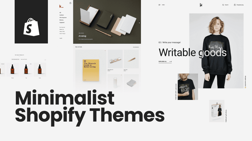
True to its name, Minimal focuses on simplicity. Its clean design and ease of use make it a favorite for small and medium-sized businesses.
Each of these themes is designed to shine on mobile devices, ensuring your store delivers an excellent user experience, regardless of how customers shop.
Why Choosing Responsive Themes Early Matters
Starting with a responsive Shopify theme from day one isn’t just convenient—it’s smart. Here’s why:
- It saves you the hassle and cost of redesigning your store to fix mobile usability issues later.
- It sets the foundation for long-term customer engagement and loyalty.
- It positions your store favorably in search rankings and helps capture mobile shoppers right away.
Responsive themes also signal professionalism, helping build brand trust among potential customers. People are more likely to buy from a store that appears to care about their experience.
CTA Plug: Need expert help to create a stunning Shopify store? Check out The CatalystX pricing page for tailored solutions starting at just $108!
Build a Better Store with Responsive Shopify Themes
The takeaway is simple: responsive Shopify themes aren’t just an option—they’re a necessity. They improve user experience, drive SEO results, and attract mobile shoppers who increasingly dominate online commerce.
For beginners starting their Shopify stores, prioritizing the best Shopify themes for mobile stores will lay a strong foundation for success.
Your dream online store begins with a seamless browsing experience—visit The CatalystX today to build a responsive Shopify store that your customers will love!